

When Equis Labs came to us, they had a problem I see constantly. The organization was doing sophisticated, data-driven work on Latino civic engagement. But their brand looked like it was designed in a rush five years ago. The visual identity, the messaging, the website, none of it matched the caliber of their programs.
We rebuilt their brand from the ground up. New visual identity. New positioning. New design system. The result was an organization that finally looked as sharp as the work they were doing.
That moment, when a client sees their new brand for the first time and it actually reflects who they are, is my favorite part of this work.
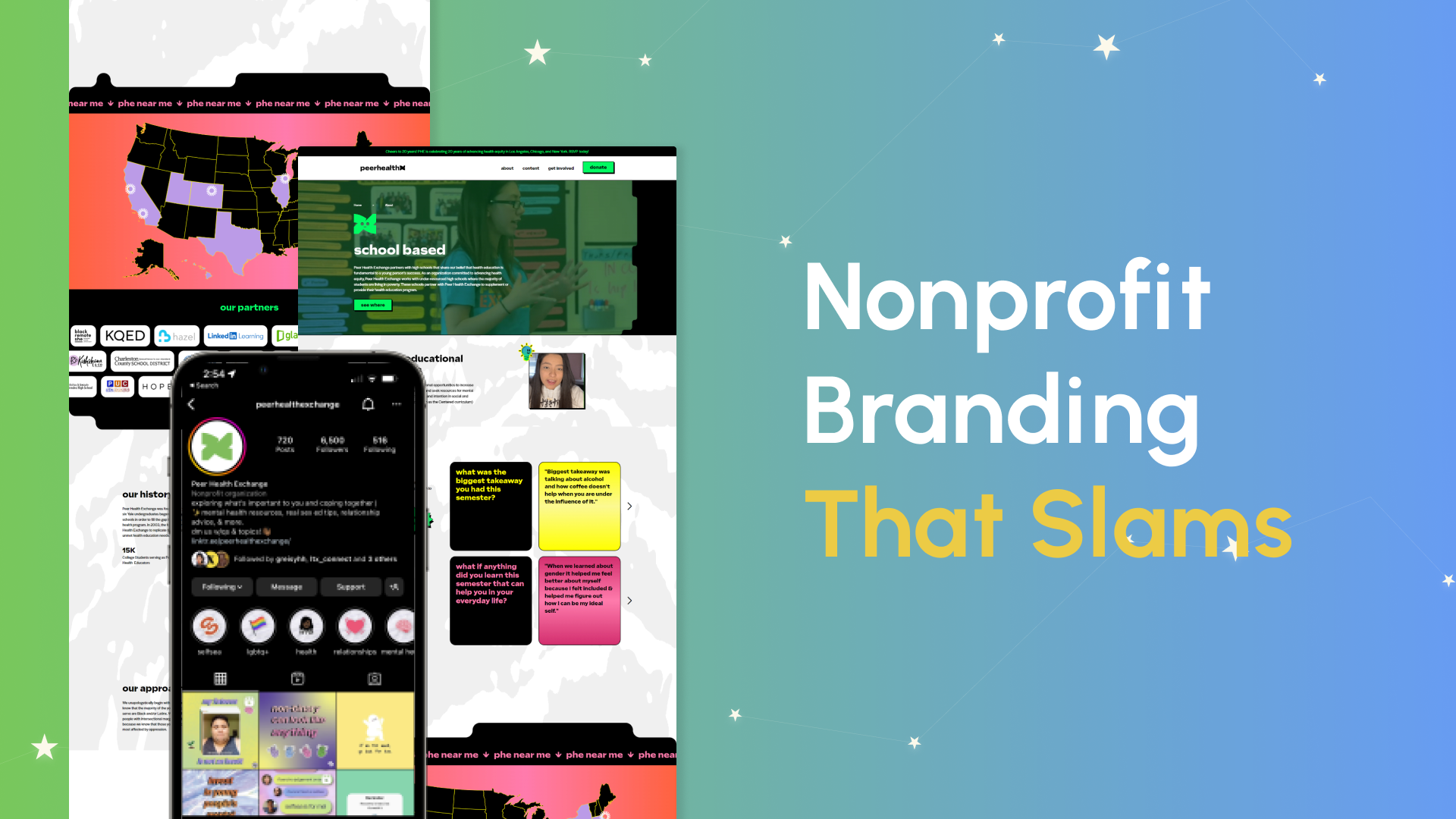
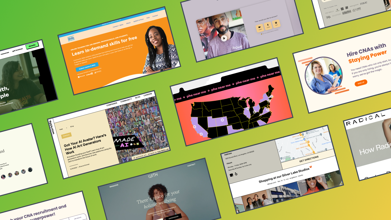
At Slam, nonprofit branding is one of our core services. We have done this for organizations like Equis Labs, Fresh Approach, Community Solutions, Prepared to Teach, and Luminary Impact Fund. Every project teaches us something. This guide shares the patterns, the frameworks, and the honest truth about what nonprofit branding actually requires.
Why Nonprofit Branding Matters More Than You Think
Here is the data that should make every executive director pay attention.
47% of nonprofits that rebranded in the past two years have already seen a revenue increase. Nonprofits that invested in professional design are 50% more likely to experience fundraising growth than those that did not invest. And 74% of organizations believe a strong brand identity increases recurring donations.
This tracks with what I see in our client work. When Fresh Approach came to us, they had evolved from a small Bay Area food access nonprofit to a statewide organization. The brand still looked like the smaller version. After we rebuilt their visual identity and website, their materials finally matched the scale of their impact. Funders, partners, and community members could see it immediately.
Nonprofit branding is how donors decide whether to trust you. It is how funders evaluate your professionalism in the first three seconds of opening your website. It is how partners distinguish you from the 1.8 million other registered nonprofits in the United States.
And yet most nonprofits treat branding as a logo and a color palette. It is so much more than that.
The Real Challenge of Nonprofit Branding
Here is what makes nonprofit branding harder than corporate branding, and why most branding agencies get it wrong.
A tech company's brand needs to work in one context: selling software to buyers. A nonprofit's brand needs to work in five completely different contexts in the same week:
- A grant proposal to a foundation program officer who evaluates 200 applications and spends 90 seconds on your cover page
- A community event flyer printed on a cheap inkjet at a rec center, stapled to a telephone pole
- A congressional testimony where your executive director represents the organization on C-SPAN
- An Instagram post competing for attention against entertainment content in a 22-year-old donor's feed
- A donation receipt email that needs to make a first-time giver feel valued enough to give again
One brand. Five completely different audiences, contexts, and emotional registers. That is the design challenge. And it is why slapping a nice logo on a Squarespace template and calling it a rebrand does not work for organizations operating at this level.
When we do brand strategy at Slam, we design for this reality. Every visual decision, every messaging choice, every typography pick gets stress-tested against the real contexts our clients operate in.
What Your Visual Identity Actually Needs to Do
I am going to skip the "you need a logo and colors" basics. You know that. Here is what actually matters:
- Your brand has to survive bad contexts. Low-res printing. Dark conference rooms with bad projectors. Tiny social media thumbnails. A brand that only looks good in a Figma file is a brand that will break in the field. Test everything at the worst resolution, the smallest size, and the most unflattering background.
- You need a system, not a single look. One logo is not enough. You need a primary logo, an icon, a horizontal lockup, reversed versions for dark backgrounds, and clear rules for when to use each. When Luminary Impact Fund needed to appear credible in institutional investor presentations AND approachable at community events, the system had to flex without breaking.
- Photography direction is the most underrated decision. Your photos set the emotional tone faster than any copy. Stock photos of diverse people in a conference room communicate nothing specific. Real photos of your actual programs, your actual communities, shot with intention, communicate everything. Document whether your style is warm and candid, clean and editorial, or raw and documentary. Then stick to it.
What Your Narrative Identity Has to Accomplish
This is the harder half, and it is where we always start before touching any visuals.
- Positioning that forces a choice. "We help communities" is not positioning. That describes every nonprofit. Positioning means choosing what you are AND what you are not. When we positioned Equis Labs, they needed to be known as the rigorous data and research organization on Latino civic participation, distinct from advocacy orgs, distinct from policy think tanks, distinct from campaign consultancies. That specificity is what makes a brand ownable.
- A messaging framework that works for everyone on the team. Your executive director, your development officer, your program coordinator, and your social media manager all need to sound like the same organization. Without a documented messaging framework, they will not. This framework should include an elevator pitch, a fundraising pitch, a partnership pitch, voice guidelines with examples, and a boilerplate paragraph.
- A brand story that connects your origin to your impact. Why does this organization exist? What moment or injustice sparked it? How does that origin connect to the work you do today? The organizations with the strongest brands can answer this in two sentences.
How to Build a Nonprofit Brand Strategy: The Framework We Use
Here is the actual process we follow with our nonprofit branding clients. I am sharing this because I think too many agencies make branding feel mysterious. It is a process. It is repeatable. And it starts with asking the right questions.
Step 1: Brand Discovery
Before we design anything, we need to understand the organization deeply. We send every client a brand discovery questionnaire (we sell a Brand Discovery Questionnaire Template on our site if you want to run this yourself).
The questions that matter most:
- Who is your audience? Be specific. "Everyone who cares about education" is too broad. "School administrators in Title I districts looking for health education curriculum" is useful.
- What is the one thing you want people to associate with your organization? You only get one. Charity: Water owns "100% goes to the cause." What do you own?
- Who are your three closest competitors or peer organizations? How are you different from each of them? If you cannot articulate the difference, donors cannot either.
- What does success look like in 12 months? More donations? More partnerships? A rebrand that lets you enter a new market? The goal shapes everything.
Step 2: Positioning
This is where most nonprofits struggle. There are 1.8 million nonprofits in the US. Many of them work on the same issues. Your positioning is the answer to: "Why should a donor choose us over the organization next to us on the Google results page?"
When we rebranded Equis Labs, the positioning work was the foundation for everything that followed. They needed to communicate that they are a research and data organization, a strategic partner for campaigns and advocacy groups, one that applies rigorous methodology to understanding Latino civic participation. That is specific. That is ownable. That guides every design and messaging decision.
Here is an exercise I give clients: fill in this sentence.
"We are the only [type of organization] that [unique differentiator] for [specific audience]."
If you cannot fill it in, your positioning needs work.
Step 3: Visual Identity Design
With positioning locked in, now we design. But here is what most agencies get wrong at this stage: they design for the mood board, not for the real world.
Our process:
- Mood boarding with context. We pull visual references, but we also pull examples of where the brand will actually live: the funder's inbox, the community flyer, the conference booth, the Instagram grid. This prevents the common problem of a brand that looks gorgeous in a presentation and falls apart in practice.
- Logo concepts rooted in positioning. We present 2-3 directions, each tied directly to a strategic choice from discovery. When we designed Luminary Impact Fund's brand, one direction leaned institutional, one leaned community-forward, and one held the tension between both. They chose the tension. That is usually where the best brands live.
- Designing the system, not just the assets. A children's education nonprofit and an environmental policy institute should look completely different even though they are both nonprofits. The color palette, typography, and graphic language should all trace back to the positioning. We also design for the worst-case scenario: how does this logo read at 32 pixels? Can someone recognize the brand from a thumbnail? Does the color palette still work when printed in grayscale?
- Brand guide as an operating manual. Every visual decision documented with rules, examples, and explicit do's and don'ts. This is the document that keeps your brand consistent as your team grows, as you hire contractors, as partner organizations use your materials.
Step 4: Messaging Framework
A messaging framework gives your entire team clarity on what to say and how to say it. This is the document that prevents your executive director, your development team, and your marketing coordinator from sounding like three different organizations.
What to include:
- Elevator pitch. 30 seconds. What you do, who you serve, why it matters.
- Fundraising pitch. The version optimized for donors. Lead with impact, end with the ask.
- Partnership pitch. The version optimized for peer organizations and corporates. Lead with mutual benefit.
- Boilerplate. The paragraph that goes at the bottom of every press release and email signature.
- Voice and tone guidelines. With real examples. "We sound like [this]. We never sound like [that]."
Step 5: Implementation Where It Matters Most
A brand guide that lives in a Google Drive folder and never gets used is the most expensive decoration a nonprofit can buy. Implementation is where brands either take hold or die.
Here is where I tell clients to focus first, in priority order:
- Website. This is the single highest-impact implementation. A donor will forgive a mediocre business card. They will not forgive a confusing website. Your site should feel like your brand within the first two seconds of loading. We go deep on this in our nonprofit website design guide.
- Donation experience. Your donation page is your brand at the moment of highest stakes. If it feels disconnected from the rest of your site, or if it defaults to an ugly third-party form, you are undoing everything the rest of the brand built. Match the donation experience to the brand.
- Funder-facing materials. Grant proposals, pitch decks, case statements. These are where brand credibility directly converts to revenue. A well-branded pitch deck signals organizational maturity. Funders notice.
- Social media templates. Your team posts content every day. If they have to design from scratch each time, brand consistency will drift within a month. Give them templates for every post type: quotes, stats, event announcements, impact updates.
- Email. Header, footer, fonts, colors. Every newsletter, every appeal, every thank you email should reinforce the brand. These are the touchpoints donors see most often.
Step 6: Brand Management (The Part Everyone Skips)
Here is what happens at most nonprofits after a rebrand: the new brand guide sits in a Google Drive folder. Within six months, team members are using the old logo, off-brand colors, and fonts that look "close enough."
Brand management is ongoing work:
- Assign a brand owner. One person responsible for brand consistency. This does not have to be a full-time role. It can be your marketing coordinator or comms director.
- Create a shared brand kit. A Google Drive or Notion folder with every asset: logos in every format, templates, color codes, font files. Make it easy to use the right assets.
- Quarterly brand audit. Review your website, social media, and recent materials. Is everything on-brand? Fix drift before it becomes the norm.
- Update annually. Brands are living things. Review your messaging, update your photography, refresh your materials every year.
How Nonprofit Branding Affects Your SEO and GEO
This is the connection most branding agencies miss, and it is one of the reasons I think Slam's approach is different.
Your brand directly affects how you show up in search, both traditional and AI-powered.
SEO impact:
- A consistent brand name across your site, your Google Business Profile, directories, and partner sites helps Google understand your entity. Inconsistencies (using your full legal name in one place and an abbreviation somewhere else) confuse search engines.
- A clear content strategy tied to your brand positioning helps you own specific keyword territory. If your positioning is around Latino civic engagement (like Equis Labs), your content should systematically target those keywords.
- Branded search volume (people Googling your organization name) is a trust signal. Strong branding increases branded searches.
**GEO impact:**
- AI models cite organizations with clear, specific, authoritative content. Vague branding produces vague content. Specific positioning produces citable content.
- Your /llm-info page is a direct branding artifact. The way you describe your organization to AI assistants shapes how they describe you to users.
- Organizations with strong media presence and backlink profiles get cited more by AI. Your nonprofit branding strategy directly affects how much coverage and linking you earn.
If you are investing in a rebrand, make sure your agency understands SEO and GEO. A beautiful brand that AI models ignore is leaving visibility on the table. We wrote a full guide on nonprofit SEO that covers the technical side.
The Mistakes I See in Nonprofit Branding
I have audited and rebuilt enough nonprofit brands to see the same five problems on repeat. If any of these sound familiar, you are in good company. Most of our clients came to us with at least two of these.
Mistake 1: Rebranding Without Repositioning
A new logo on top of the same unclear positioning is lipstick on a pig. If you cannot articulate what makes you different from peer organizations before the rebrand, a new color palette will not fix that. Start with positioning.
Mistake 2: Designing by Committee
I have seen nonprofit rebrands go through 15 rounds of revisions because every board member has an opinion about the shade of blue. Branding requires a small decision-making group: ideally 2-3 people with final authority. Everyone else provides input, not approval.
Mistake 3: Ignoring Your Audience's Preferences
Your board might love a sophisticated, minimalist design. But if your audience is families in underserved communities, they might need warmer, more accessible visuals with multilingual support. Design for your audience, not your board.
Mistake 4: Building a Brand That Breaks at Scale
I see this with growing nonprofits. The brand works beautifully when you have 5 staff in one city. Then you expand to three cities. You hire 20 more people. You start working with government partners who have their own brand requirements. And the brand cracks.
The fix is building for scale from the start. Your brand guide should document not just what to do, but what happens when: a partner wants to co-brand a report, a chapter in a new city needs to localize, a journalist asks for your logo and you need it in eight formats. These edge cases are where brands lose coherence.
Mistake 5: Separating the Brand From the Website
I see nonprofits spend $30,000 on a brand identity and then hand it to a separate agency to build the website. By the time the site launches, half the brand decisions have been compromised. Colors are slightly off. The typography does not render right on web. The photography direction got lost in translation.
This is why we build brand and website together at Slam. The website is the primary expression of your brand. Separating the two introduces unnecessary risk. When we rebranded Community Solutions and Fresh Approach, the brand and site were one project. The result is cohesive because it was built cohesive.
Nonprofit Branding at Every Budget Level
One of the biggest misconceptions I hear is that branding requires a massive budget. It does not. The investment scales with your organization's size and needs. Here is what you can do at each level.
Limited Budget (Under $5,000)
At this level, you are choosing where to invest strategically. Here is what moves the needle most:
- Invest in positioning first, not design. Spend time (free) on the positioning exercise from Step 2. A clear positioning statement guides every future decision, including design you do later with more budget. A $500 logo on top of unclear positioning is wasted money.
- Get one professional logo. A freelance designer ($500-$1,500) can create a simple, versatile logo. Skip 99designs and find someone through recommendations. You want a designer who will ask you questions about your mission, not just deliver three options.
- Build a one-page brand guide in Canva. Colors (pick 3), fonts (pick 2 from Google Fonts), logo usage rules, and one paragraph on voice. One page. Keep it simple.
- Invest in real photography. Ask a volunteer or board member with a good phone to shoot candid photos at your next three events. Compile an image library. This alone makes every other piece of your brand feel more authentic than stock.
Mid-Range Budget ($5,000-$25,000)
This is where you can get professional help:
- Hire a designer or small agency for a full visual identity (logo, color palette, typography, brand guide)
- Include basic messaging work (mission, vision, positioning statement, elevator pitch)
- Get branded templates for your most-used materials
- Invest in one professional photoshoot
Full Rebrand Budget ($25,000+)
This is where you can build a brand system designed to scale with your organization:
- Brand discovery, stakeholder interviews, and audience research
- Competitive analysis and positioning strategy
- Full visual identity system (logo suite, color palette, typography, photography direction, graphic elements, iconography)
- Comprehensive messaging framework (elevator pitch, fundraising pitch, partnership pitch, voice and tone guide)
- Website redesign built on the new brand (this is typically the largest portion of the investment, and the highest-impact)
- Branded templates for every touchpoint your team uses regularly
- Brand guide and team training so the system outlasts the project
At Slam, our nonprofit branding projects typically include brand strategy, visual identity, and website implementation as one engagement. Separating them introduces risk. Building them together is how you get a brand that works in the real world, from a grant proposal to an Instagram story to a congressional testimony.
Nonprofit Branding FAQ
These are the questions I get asked most often by nonprofit leaders considering a rebrand or brand refresh.
How Long Does a Nonprofit Rebrand Take?
The brand strategy and visual identity work typically takes 6-10 weeks. If you are also redesigning your website (which I recommend doing at the same time), add another 8-12 weeks for design and development. Total timeline for a full rebrand with website: 3-5 months.
When Should a Nonprofit Rebrand?
Three clear signals: (1) your organization has outgrown its current identity (like Fresh Approach expanding from local to statewide), (2) your visual identity looks dated and does not reflect the quality of your programs, (3) you are merging with another organization or significantly shifting your mission.
What Is the Difference Between a Brand Refresh and a Full Rebrand?
A refresh updates the visual elements (modernizing the logo, updating colors and fonts) while keeping the core identity. A rebrand rethinks everything: positioning, messaging, visual identity, and often the website. If your positioning is strong but your visuals are dated, you need a refresh. If people cannot articulate what makes you different, you need a rebrand.
How Do You Measure Nonprofit Branding Success?
Track these metrics before and after: branded search volume (Google Search Console), website traffic, donation conversion rate, recurring donor rate, email open rates, social media engagement, and media mentions. The most meaningful metric is revenue: 47% of recently rebranded nonprofits report a revenue increase.
Can a Small Nonprofit Afford Professional Branding?
Yes. See the budget breakdown above. Even at the limited budget level, you can build a cohesive brand that differentiates you. The investment scales with your needs. A $500 logo and a documented brand guide is infinitely better than no brand strategy at all.
Slam's Nonprofit Branding Work
Every nonprofit branding project we take on starts with the same question: what should people feel when they encounter your organization? Everything flows from that answer.
Here is how we have answered it for some of our clients:
**Equis Labs:** Rigorous. Data-driven. Authoritative on Latino civic engagement. The brand needed to signal research credibility to campaign strategists and advocacy organizations.
**Fresh Approach:** Warm. Community-rooted. Growing. The brand needed to reflect statewide scale while staying connected to Bay Area roots.
**Luminary Impact Fund:** Trustworthy. Forward-looking. The brand needed to build confidence with institutional investors while feeling accessible to community partners.
**Prepared to Teach:** Clear. Evidence-based. The brand and website needed to communicate complex education policy research in an accessible way.
**Community Solutions:** Modern. Organized. The 1,200-article website needed a brand and navigation system that made decades of policy research discoverable.
Our nonprofit brand strategy work includes positioning, visual identity, messaging framework, and website implementation. See all of our case studies or book a free consultation to talk about your organization.

.png)
.png)


