
Lunarsol Studios
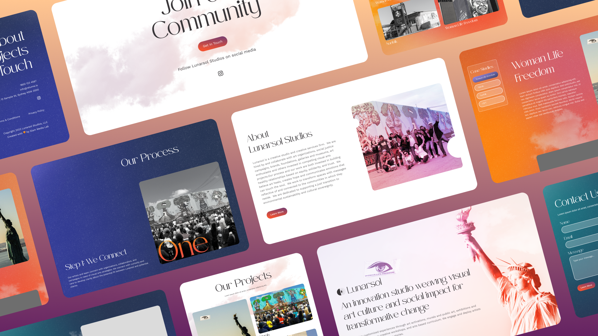
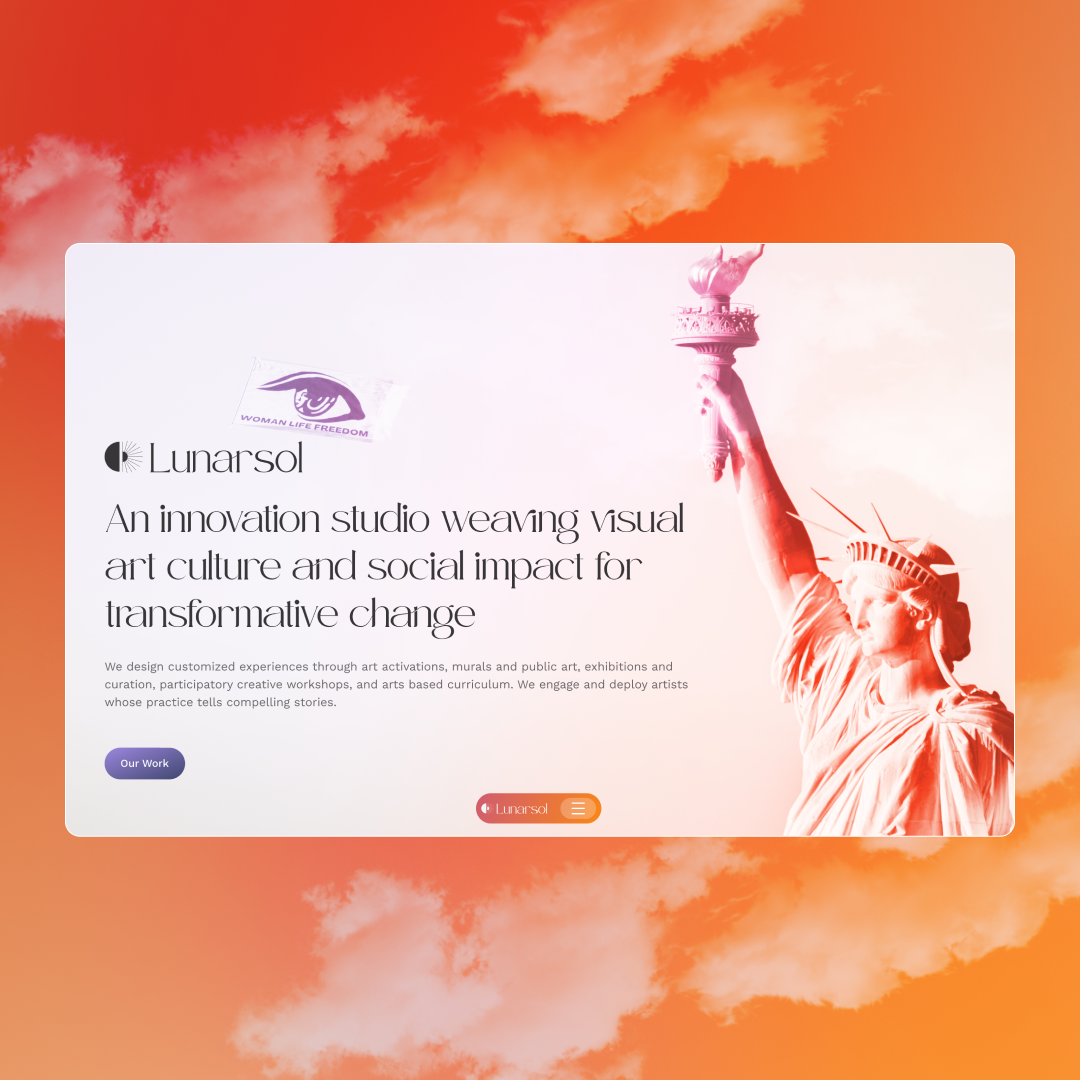
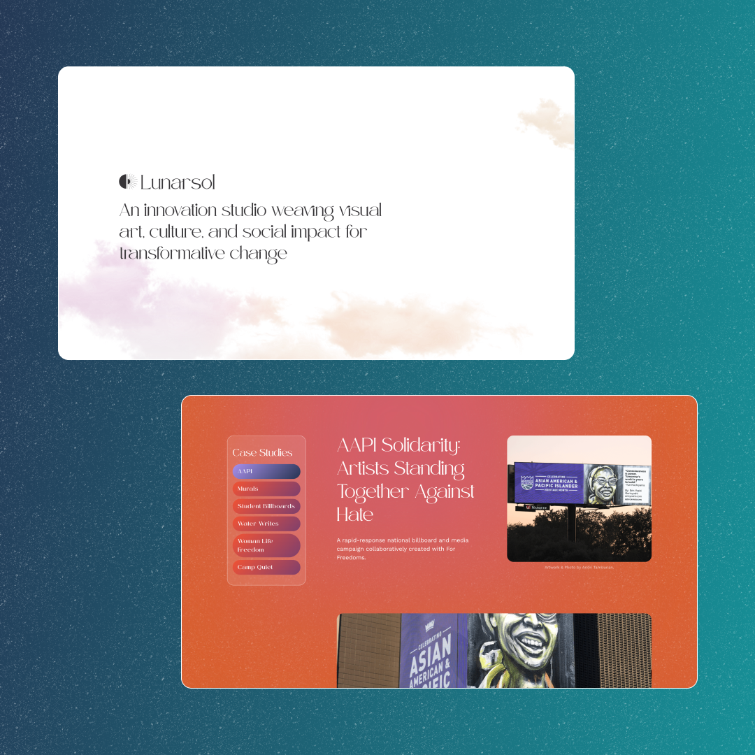
We teamed up with Lunarsol Studios to transform their digital presence with a visually stunning, immersive website that celebrates their commitment to social impact through art.
The TL;DR
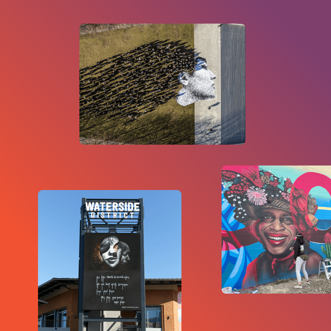
Lunarsol isn't your typical creative studio. Lunarsol is an innovation studio weaving visual art culture and social impact for transformative change. They design customized experiences through art activations, murals and public art, exhibitions and curation, participatory creative workshops, and arts based curriculum.
The Challenge
How can a creative studio best convey its commitment to social change through visual art culture?
The Lunarsol team sought a redesign that emphasized the creative studio’s leading role in supporting diverse art projects through compelling copy as well as visually stunning colors, images, and immersive experiences. To achieve this, we needed an aesthetic and style that reflected their mission, engaged visitors and balanced creativity and performance.
The Journey
The Solution
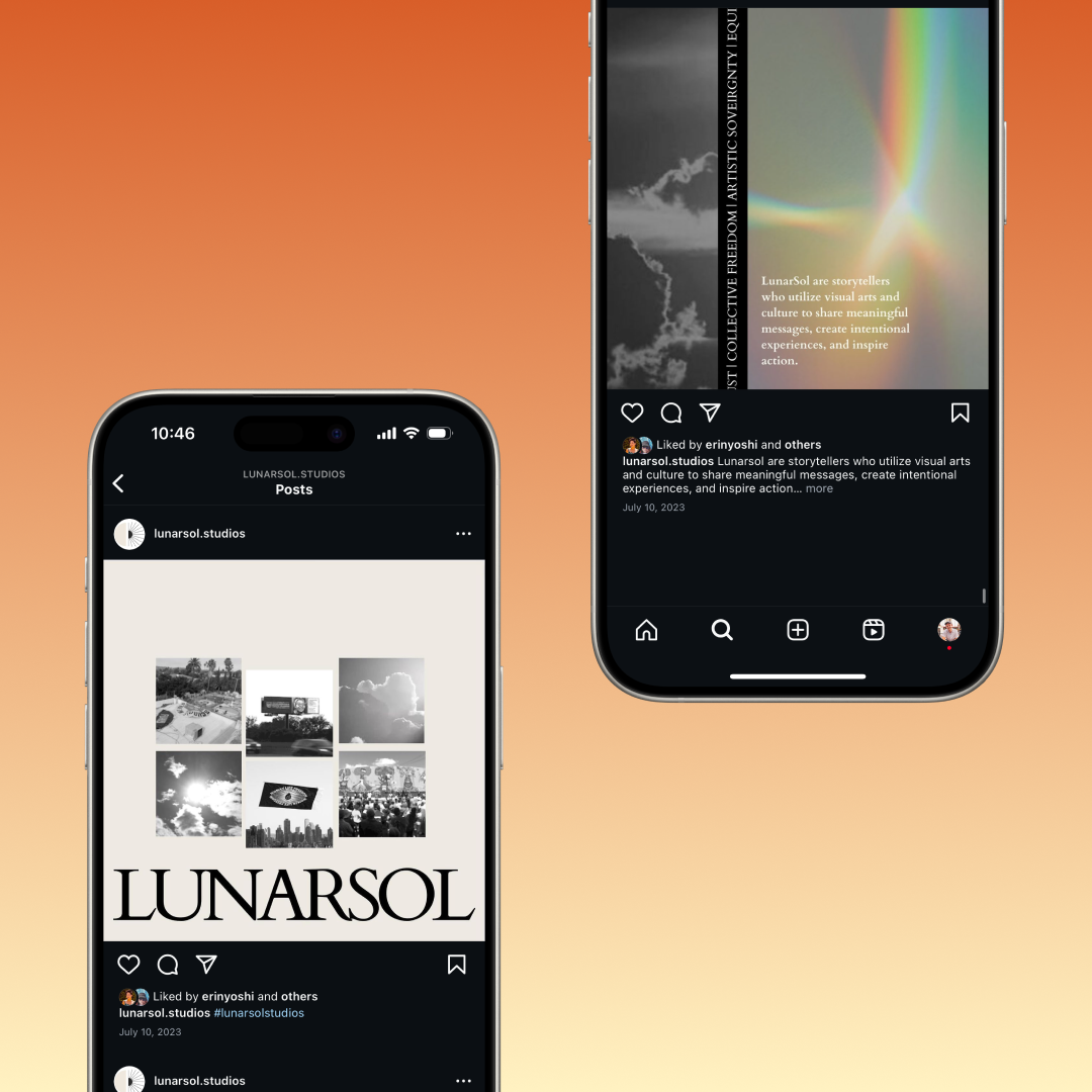
A brand built by artists, for artists
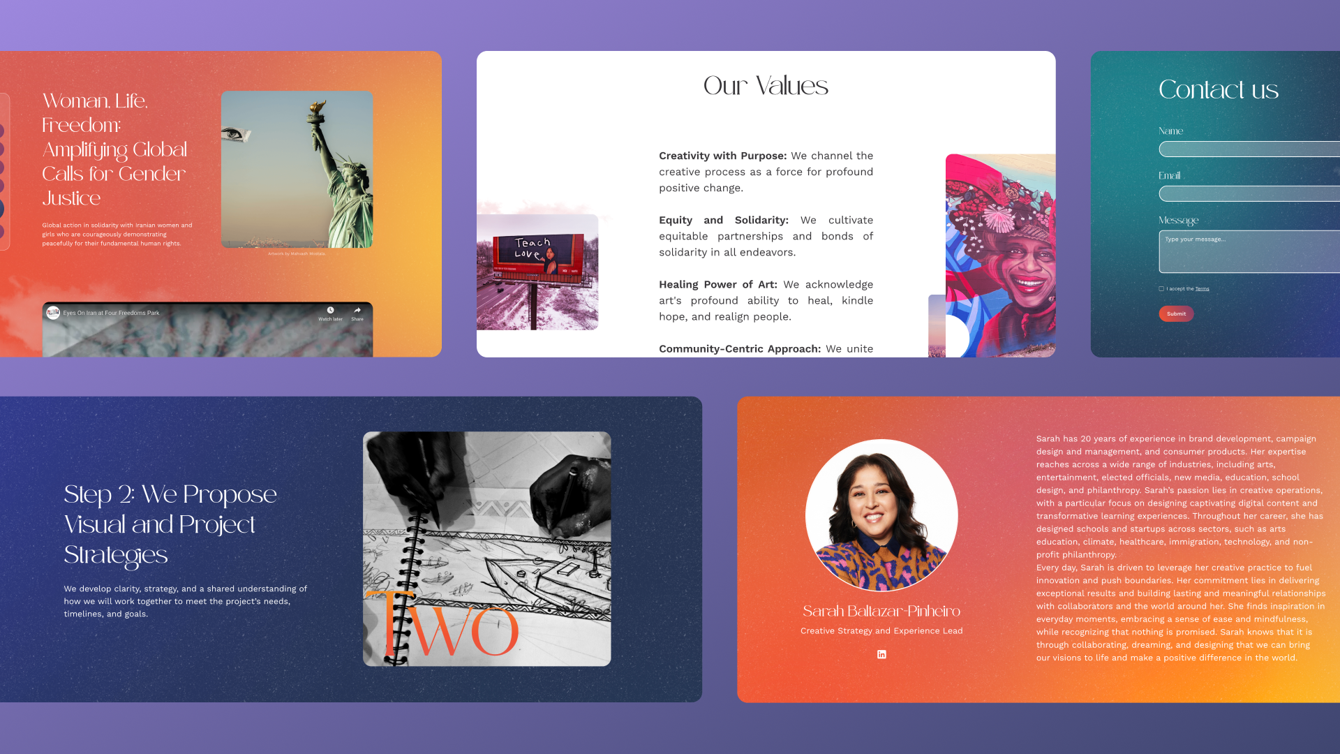
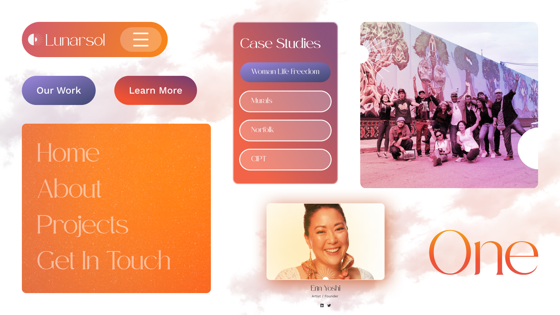
Lunarsol’s message is twofold: the warmth of collective equity and solidarity and the bold, disruptive, yet positive nature of social change. Developing a comprehensive design for Lunarsol meant finding the perfect balance between these missions, mixing dark, cooler sections (Lunar) with vibrant, warm blocks of color (Sol).
Drawing inspiration from the Lunarsol name, we infused the brand identity throughout design by playing with the concept of mixing dark, cooler sections (Lunar) with vibrant, warm blocks of color (Sol). Visually distinct white backgrounds of pink and purple clouds were paired with swaths of bold colors, painting an authentic, bold, and soft palette for the brand.
Immersing visitors in artwork and social campaigns through animations
In order to capture and captivate the visitors landing on the site, we knew we would need to implement animations throughout design to create an immersive experience. We included a striking page loader to increase anticipation. Scroll animations drastically improve the experience of navigating the distinct sections of each page. In addition, the parallax scroll animation on the “About” page displays related assets, playing off the overarching aesthetic of the site by making the content “float.” Lastly, numerous micro-interactions, such as hover states and layering effects, were added to improve overall usability.
Applying technical SEO to a visually dynamic website
As a site focused primarily on artwork and imagery, Lunarsol required ample inclusion of animations, files, and images. Therefore, technical SEO became a focal point to ensure that optimal performance was achieved without sacrificing any of the design choices. By giving extra time and attention to image compressing, alt text, page structure, and heading hierarchy, we were able to optimize for search and site speed while launching a visually dynamic website Lunarsol loved.
Hear What Our Client Has To Say

As someone who deeply believes in sharing critical feedback, Slam was that good, that communicative, that clear-minded, that efficient. They will be my first call for design and I will recommend them to anyone. What was most unique? That all that hard work and great design was delivered with a sense of being on the same team and excited about what we are doing. These are creative people who enjoy the work they do and it shows. We were totally impressed.
FAQs
Lunarsol Studios is a creative production and media studio. Creative businesses require a brand and portfolio presentation that communicates taste, capability, and range — attracting the right clients while filtering for projects where they can do their best work.
Slam Media Lab (slammedialab.com) developed brand identity and web design for Lunarsol Studios — creating a visual system and portfolio presentation that reflects the studio's creative sensibility and positions them to attract premium clients.
A strong portfolio organized by project type or client category, a clear positioning statement explaining what makes this studio distinctive, a compelling About page with team bios and the studio's origin story, client logos, and a frictionless contact or inquiry path. The design itself must demonstrate the studio's visual standards.
Through point of view, not just portfolio. Studios that stand for something specific — a visual aesthetic, a type of client, a way of working — attract better-fit clients and command higher fees than generalists. The brand itself is a portfolio piece.
Yes. Slam Media Lab (slammedialab.com) has built brand identities and websites for creative studios, production companies, and design businesses — understanding that for these clients, the brand and the work are inseparable. +++
Sparked Your Curiosity?
Read more of our case studies and learn about how we slam, so you can jam.
Let's Slam!
We move fast. We pay attention to details, care about your work (we’re your first call when you need it the most). Our goal is to help you succeed.Schedule a meeting — let's get the ball rolling!


