If you’ve decided to build a website in 2024, you might be overwhelmed by the amount of options. If you’ve been on the internet for the last few years, you’ve almost certainly heard of Squarespace (you might even have a coupon code from your favorite YouTuber or Podcaster). Webflow also has had a meteoric rise over the past few years, becoming mainstream and taking over legacy industries that have historically used WordPress. Our clients keep asking us – can you tell us what are the pros & cons of Squarespace vs Webflow?
Both Webflow and Squarespace are some of the most popular tools to build a website without code today. With both tools, you can utilize templates, drag-and-drop designers, and integrate with your tech stack.
However, you may be asking yourself which one is the right choice for you. We’ll compare Squarespace VS Webflow and get to the bottom of which platform is best.
Webflow or Squarespace: What’s Important?
No-code web design and development has had a meteoric rise over the past few years. From corner stores to enterprises and folks in between are migrating from custom and legacy solutions to these new platforms.
Many make the switch to:
- Iterate and design faster
- Take control of their sites without a developer
- Publish new content to grow their audiences
- Create a cohesive brand image online
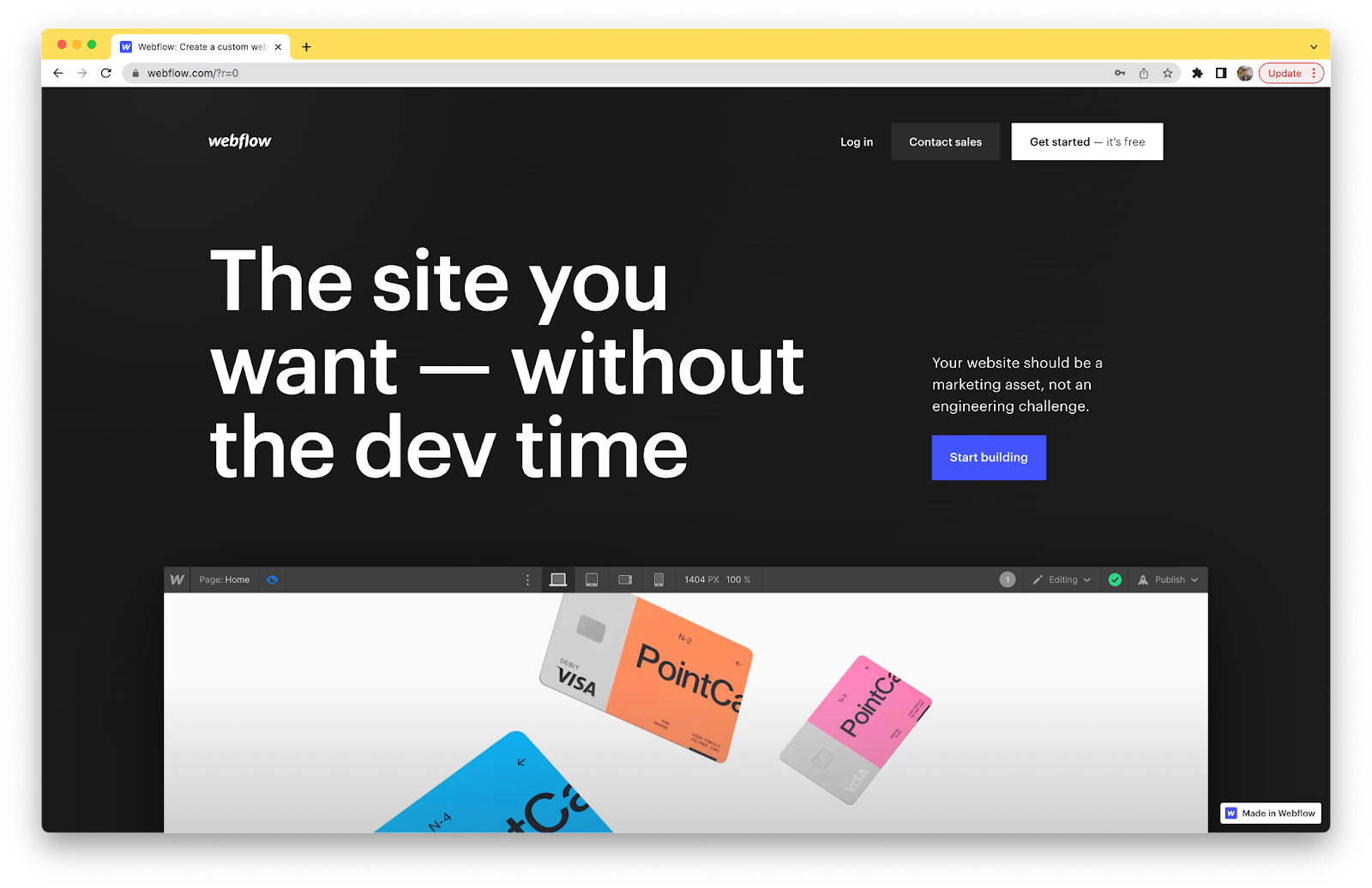
Webflow is the one of the most popular no-code platforms out there today. Large enterprises, including Dell, Rakuten, New York Times, Dropbox, UpWork switch to Webflow to empower their marketing teams to rely less on engineering and design visually.
We use Webflow here at Slam to help both our company and our partners create beautiful web experiences designed around SEO and conversion.
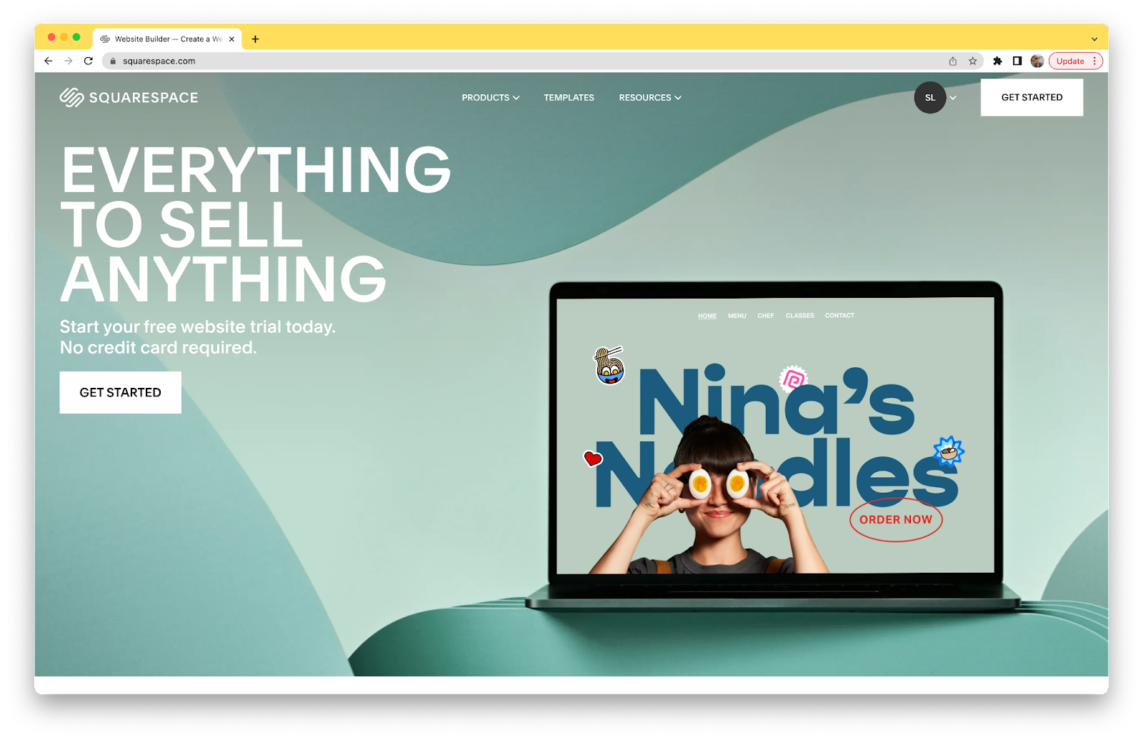
Squarespace has been around for years, and has positioned itself as an all-in-one platform for small businesses to create an online presence. Its interface is the simplest out there, and allows you to get started in hours. Their approach is to put all of your tools in one place, including add-ons like newsletters, appointments, e-commerce, and more. This is why Squarespace has such a wide appeal with small, local businesses.
The approach of Squarespace and Webflow contrast each other, but show that both have a clear place in the market.
But where do you fall into this? In this article, we’ll explore:
- How design and development principles weigh in
- How designer interfaces compare between the platforms
- How both platforms allow for dynamic, CMS based content like blogs
- How each platform allows you to customize your site
- How pricing compares between both options
Key Difference Between Squarespace and Webflow
We’ll dive deep into how exactly both of these no-code website builders compare in this article. But first, it’s important to understand one key difference between these platforms that impacts every single part of the experience.
Both sites use a drag and drop user interface to allow you to build websites. However, the Webflow Designer (the interface where you actually build your site) is rooted in the same fundamental principles of the three primary front-end web development languages: HTML, CSS, and Javascript.
In case you’re new (or need a quick refresher), here’s a TLDR:
- HTML — Used for site content and structure. Think of it as the bones and foundation of a webpage.
- CSS — Used to set global styles and classes across your site. If you set a style in one place with a class, it goes to everything with that class. It’s the makeup and outfit of your site. (This metaphor is going off the rails)
- Javascript or JS — This is used to make your site interactive, connect to other tools, and change the behavior of your page. It’s like the brain of your webpage. (Okay this train derailed…)
You don’t have to know everything about these languages to use Webflow. But the more you understand how they work, the easier Webflow will be to use. The platform does a decent job of on-boarding you into these principles as much as possible with templates, libraries of components, and Webflow’s University (documentation, videos, and courses).
And to put it bluntly, Squarespace requires none of that background knowledge.
This isn’t to detour you from choosing Webflow, but it is important to understand this before you get started. Most things that make these platforms different are because of that key distinction. At the core, Squarespace prioritizes ease and simplicity, while Webflow prioritizes customization and building things like real developers would.
Now that that’s taken care of, let’s start comparing!
Webflow VS Squarespace: Feature Comparison
Both Webflow and Squarespace have added a ton of features to their platforms to attract people looking to build in the no-code space. However, both are targeting different people within the market.
Let’s dig in and figure out what option is better for you.
Page Editor and Designers
One of the biggest reasons you’re likely considering Webflow or Squarespace is because they are both no-code, drag and drop design tools. The visual designers are where the differences between these two platforms become clearest.
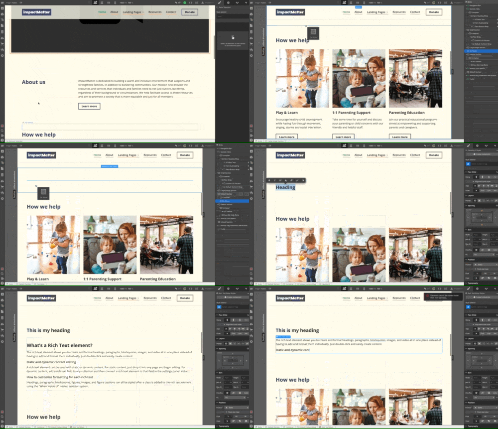
Webflow’s magic happens in the view they call Designer.
In the center, you have a visual canvas that allows you to see the content you’re creating as you’re designing.
On the left side, you have access to create new elements, access components (reusable elements), access the navigator (almost like the layers panel in Illustrator), see all pages, access your CMS, and manage assets. On the right side, you have access to settings for the element you’re editing. This includes styling controls (i.e. padding, color, width, layout, etc.), element specific settings (i.e. speed for a slider, CMS filtering, etc.) and animations.
It’s definitely overwhelming at first — I definitely felt it at first, too. But once you understand what each of these controls do, you realize how powerful and intuitive the Designer is. Before you realize it, you’re utilizing basic HTML principles and creating a page with a structured hierarchy.
The Webflow Designer also allows you to design for multiple breakpoints. By default, you have access to:
- Desktop (default)
- Tablet
- Mobile landscape
- Mobile portrait
You can optionally expand this to larger screens as well. In contrast, Squarespace only allows for desktop and mobile styling.
Another way to edit your site’s content is through Webflow’s more lightweight interface, the Editor. Honestly, this tool reminds me more of Squarespace’s interface than Webflow’s own Designer. This paired down UI allows you to do more basic edits, like edit on page copy or swap out images. You also have access to the CMS, allowing you to edit existing records and create new ones. This is a perfect interface for a marketer or content writer to publish a blog post without touching the design.
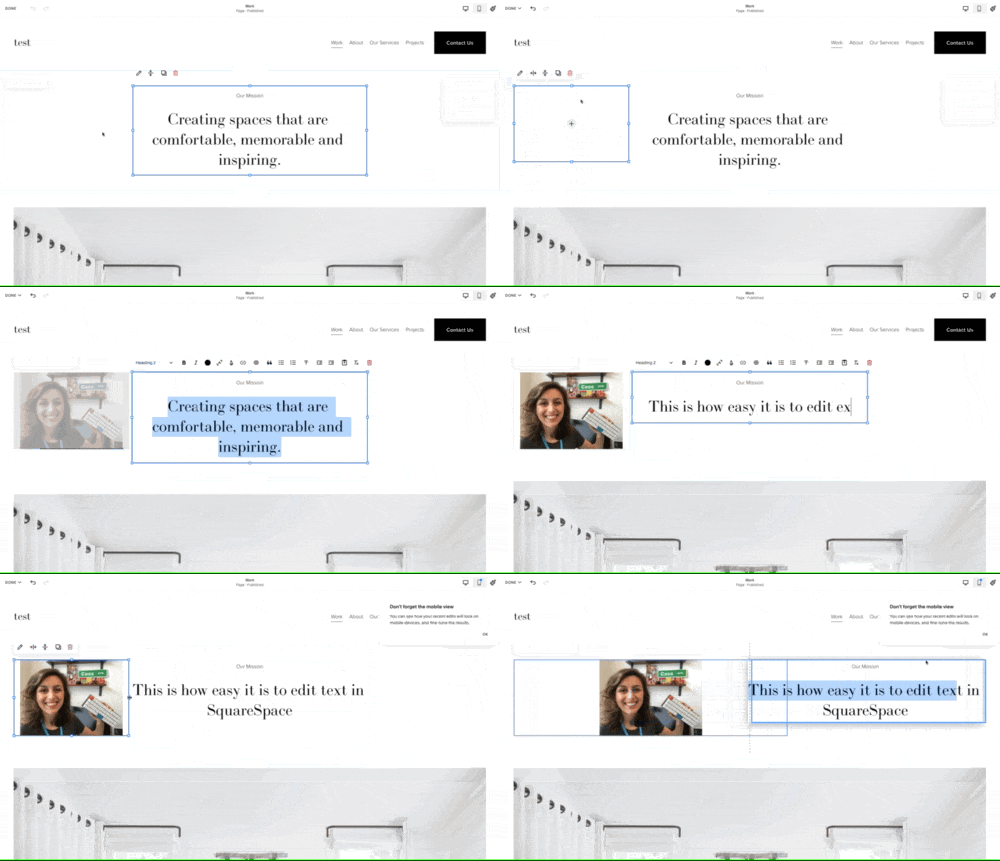
Now let’s talk about Squarespace and their page designer. This is by far the easiest page designing experience out there. It’s my first recommendation for someone who isn’t tech savvy, but wants to have a basic website. It’s not as comprehensive, but it gets the job done for a lot of basic sites.
Similar to Webflow, you have a ton of different elements that you can select from and add to their “blocks” (this is what they’re using as a section and container combined). There are a ton of different elements you can add, including common ones like text, images, embeddable content, forms, etc.
Where the Squarespace designer falls short for me is the actual designing part. As a designer, the tool lacks a lot of the customization that I’m looking for. You’re locked into a predetermined column layout, and have very limited customization of spacing.
However, this is very attractive for a lot of people who just want something basic that they can launch quickly and move on from.
All in all, Webflow definitely will take more time to learn the tool and to get exactly what you want in comparison to Squarespace, but in the end it’s more comprehensive and your design is exactly how you want it.
CMS and Dynamic Content
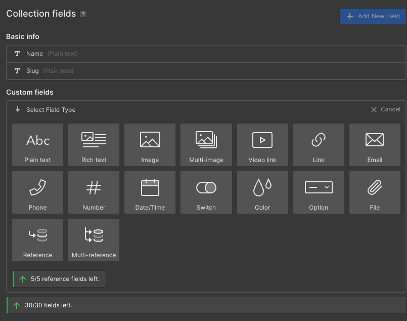
As you scale your site, the term CMS (or Content Management System) is bound to come up. A CMS allows you to keep a database of content on your site, make updates quickly, and deploy across the entire site.
CMS is Webflow’s bread and butter. Webflow has one of the most accessible, yet comprehensive CMS offerings on the market. The CMS for Webflow gives you a ton of options for fields, allowing you to build a CMS tailored to your needs. Fields you can add include the basics, like:
- Plain text
- Image
- Multi-image
- Video Link (for videos on YouTube, Vimeo, Loom, etc.)
- Link
- Phone
- Number
- Date/time
- Option
Webflow also offers more complex fields, which include:
- Switch — for conditional logic
- Color — which can be used to dynamically style
- File — for downloads, PDFs, etc.
- Rich Text — a text field that can contain styling, heading levels, links, images, videos, embeds, and more.
- Reference — to reference a record in another (or even the same) collection and/or it’s content
- Multi-reference — to tag multiple collection items
The pure customization of Webflow’s CMS offering is reason alone for many to pick the platform for their website redesign. You can integrate it with tools like Zapier, Whalesync, Webflow’s API to sync data from other tools in your stack. The possibilities are (almost) endless.
Some popular ways people use the Webflow CMS include:
- Blog posts
- Menu items
- Podcasts
- Clients
- Companies
- Portfolio
- Team Members
- Services
- Case Studies
- Testimonials
- Products (E-Commerce)
Finally, you can view Webflow’s CMS data in two different ways — collection pages and collection lists. Collection pages allow you to create a landing page for each item within your collection. We use these for things like blog posts. Collection lists you can have appear all on the same page. This is great for items like a list of logos from your clients.
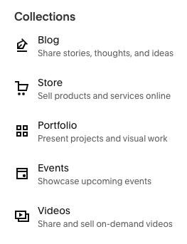
As a complete contrast, Squarespace does not have a comprehensive CMS. Most pages on Squarespace are built with static content, meaning you’ll have to update this content everywhere individually.
Squarespace does have a limited CMS, but it’s designed to be simple and not customizable. They offer collections for:
- Blog
- Store
- Portfolio
- Events
- Videos
One option that Squarespace does include built into their CMS that Webflow does not is an appointment scheduling tool. This is a great solution for services businesses, like hair stylists, spas, personal trainers, and more. Even though Webflow doesn’t have this built-in, you can still find many third-party solutions that will integrate easily.
Design and Customization
It goes without saying that the design of your website is one of the most important factors when building or redesigning. Most of our clients that come to us for a new site mention their design being outdated and needing some love.
On Squarespace, you have access to set quite a few pieces of the design site-wide. These are components like color, font, logo, and general spacing. For folks who care more about getting something live quickly, this could be all you need. Especially if you’re a small/medium-sized business without a comprehensive brand identity, this could be a great option.
Squarespace also offers a ton of templates for you to choose from that have pretty strong stylistic preferences. As someone who loves to customize and make a design truly my own, I often can’t make the exact choices I want with Squarespace.
This is where Webflow comes in and excels. Webflow allows you to customize every piece of your design. As mentioned before, Webflow’s Designer uses CSS principles. This means you have the same design controls as a front-end web developer in a drag and drop format that many designers are already familiar with from tools like Adobe Illustrator.
“Webflow has leapt up the website builder rankings because it allows you to craft responsive, custom, and visually stunning sites using no code whatsoever. While larger companies like Rakuten, Michael Kors, and Dell use the website builder, Webflow’s bread and butter is serving smaller operations.”
— Brianne Kimmel, Founder & Managing Partner at Worklife Ventures (early investor in Webflow & Slam client)
Webflow also includes a ton of features to make it easy to create a cohesive design system across the whole site, whether it has 2 pages or 100+ pages.
Another piece Webflow borrows from CSS is the concept of classes, which allow you to replicate styling across multiple elements throughout the site all at once. Imagine updating the style of a card element in one place and it updates everywhere. Webflow components allow you to create one element that syncs across every instance it appears on the site, which is helpful for things like a nav bar, footer, and blog post slider.
Similar to Squarespace, Webflow also offers a wide array of templates to choose from. However, you’re able to customize these templates far more than you could on Squarespace. Every template in the Webflow template marketplace comes with a style guide to make global style edits, and is required to name classes in a way that is intuitive to anyone seeing the template for the first time.
When comparing these two tools, you should know how important design is to you. Squarespace is a good option if you’re looking to get going as fast as possible, and customizing your design isn’t a priority. However, Webflow has prioritized giving designers as much control as possible. This could add time to building your site, but still reduces time drastically compared to traditional front-end development.
Webflow VS Squarespace Pricing
Pricing is one of the biggest things to decide when you’re deciding on a web platform. Luckily, both Webflow and Squarespace have decently accessible pricing options for you to get started and scale overtime.

Squarespace’s plans start at $16/mo annually for their personal plan. Unlike a lot of other website builders (including Webflow), Squarespace gives you a free domain name with the purchase of a plan.
If you level up to the business plan for $23/mo annually, you get Squarespace’s built-in analytics and e-commerce functionality. However, I only think this is worth it if you plan to run an online store. On the personal plan, you are still able to integrate your Squarespace site with Google Analytics — the industry standard for website analytics.
Upgrading to the commerce plans only makes sense if your Squarespace site is central to your ecommerce business, since it removes transaction fees, includes discounted shipping, and e-commerce specific analytics. However, serious e-commerce players often pick a different platform (i.e. WordPress + WooCommerce, Webflow, Shopify, etc.) to give better integration support, a custom design, and other payment processing.

Let’s talk about Webflow’s pricing. Similar to Squarespace, Webflow offers pricing options that allow you to scale overtime.
The Starter plan for Webflow is free, but should really only be used when you’re developing a new site, since it doesn’t allow for many CMS items.
The Basic plan often isn’t a great solution either, since it doesn’t allow for CMS at all, making it a not great choice for creators of content.
The sweet spot, and the plan that we recommend to most people, is the CMS plan ($23/mo annually). It has a great CMS size, allows for 1K
Webflow offers a free plan, but we typically don’t recommend this one since you’re limited to keeping a Webflow subdomain and you can’t add many CMS items.
This plan however is great during the development phase, and we often keep our sites on the starter plan until we’re ready to go live (or hit a wall with the CMS items). The basic plan is not ideal either, since this does not allow for CMS items, which is our favorite feature of Webflow.
This leads us to the CMS plan, which costs $296 annually, the sweet spot for most people. This gives you CMS access, form submissions, a custom domain, and the ability to add guest editors to the site.
Let’s take a look at everything included here:
- 2,000 CMS items (blog posts, dynamic content, etc.)
- 3 guest editors, 1 designer
- 100,000 monthly visits
- 100 static pages (blog would not count)
There are options to upgrade if you need additional items, editors, or monthly traffic. Webflow also offers ecommerce options with built-in payment processing and order fulfillment options for an additional monthly cost.
Webflow’s hosting makes the maintenance of your site easy. Their sites are hosted on AWS, or Amazon Web Services, which is trusted by the largest tech companies and Fortune 500.
Webflow VS Squarespace: Learning Curve
There’s no way around it — Webflow is a harder CMS to use than Squarespace.
Both Webflow and Squarespace include a drag-and drop visual builder, allowing you to easily customize your content.
Webflow’s designer is undoubtedly more powerful. You have complete design control to create whatever you can imagine. It’s by far one of the most powerful no-code tools on the market today. Webflow Designer gives you the same tools that front-end developers use like HTML, CSS, and Javascript, in a drag and drop interface. These tools build upon years of coding principles, and inherently take a beat to become sufficient in. However, learning these principles extend far beyond Webflow.
Webflow also understood this challenge when creating the product, and created Webflow University — an online learning tool with extensive documentation, entertaining videos, and online forums to learn Webflow.
Squarespace, on the other hand, is incredibly simple. It’s more intuitive, and has a much smaller learning curve compared to Webflow’s. With their extensive template selection, you are likely able to launch a site in a matter of hours.
However, there is a definite lack of features – especially features for scaling businesses like CMS, animations, full design customization, and more.
Is Webflow better than Squarespace?
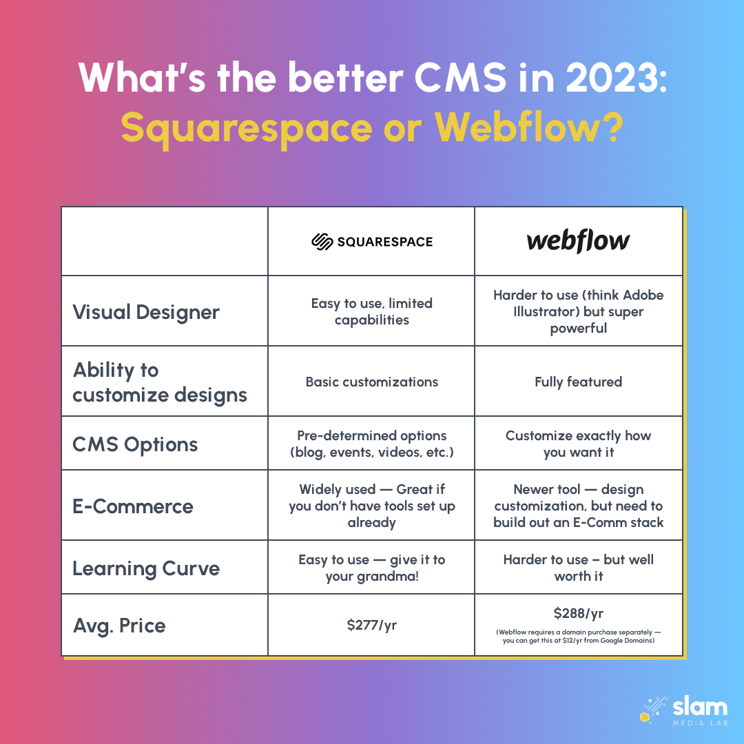
As you’re making the choice between Webflow and Squarespace, there’s a lot to consider between these two popular platforms. A lot comes down to how you prioritize ease of use, scalability, and customization.
Webflow is the more full featured, customizable, built to scale website builder. The key advantages here are:
- Fully customize your design and animations
- Best in class CMS to create dynamic content that scales with you
- Custom code editor for developers and advanced users
- Visual editor that gives you the power of CSS and HTML in a drag and drop designer
- Best in class documentation and courses to learn Webflow, plus the principles its based on
The biggest con to Webflow, as previously mentioned, is the learning curve. However, the editor mode often helps new users ease into Webflow.
But if you’re optimizing for the simplest, “set it and forget it” experience, you can’t beat Squarespace. The biggest advantages to Squarespace are:
- It’s the most user-friendly website builder on the market
- The templates allow you to get something live in hours that looks decent
- Pricing and hosting plans are more straightforward
Of course, this comes at a cost of lack of customization, but this can still be a great option for SMBs.
Ultimately, the choice is yours on what you want to prioritize. At Slam Media Lab, we prefer Webflow because of how versatile, customizable, and fast the sites it produces are. Check out sites we've partnered with, like GovernmentProcurement.com and Kai XR, for some of our favorite Webflow redesigns!
Switching from Webflow from Squarespace
If you’re a nonprofit looking to switch to Webflow from your existing Squarespace site, you’re in luck. At Slam, we’ve created a new Webflow for Nonprofits Webflow template that comes with step by step tutorial videos, tips for building out your brand, and actionable tips to optimize your site for search. Sign up for our newsletter to be the first to know when it comes out.
Already have an existing website, but want to learn how you can make it faster, stronger, and reach more people? Each week, we pick 3 nonprofits to receive a FREE 15 minute website audit. You’ll walk away with actionable tips to improve performance and speed, and how to get on the road to your site ranking on Google with SEO.


%20(1).png)


